
#0E0030
R: 14, G: 0, B: 48
C: 100, M: 98, Y: 42, K: 67
#E9FBFF
R: 233, G: 251, B: 255
C: 10, M: 0, Y: 2, K: 0
#6E80D6
R: 110, G: 128, B: 214
C: 64, M: 50, Y: 0, K: 0
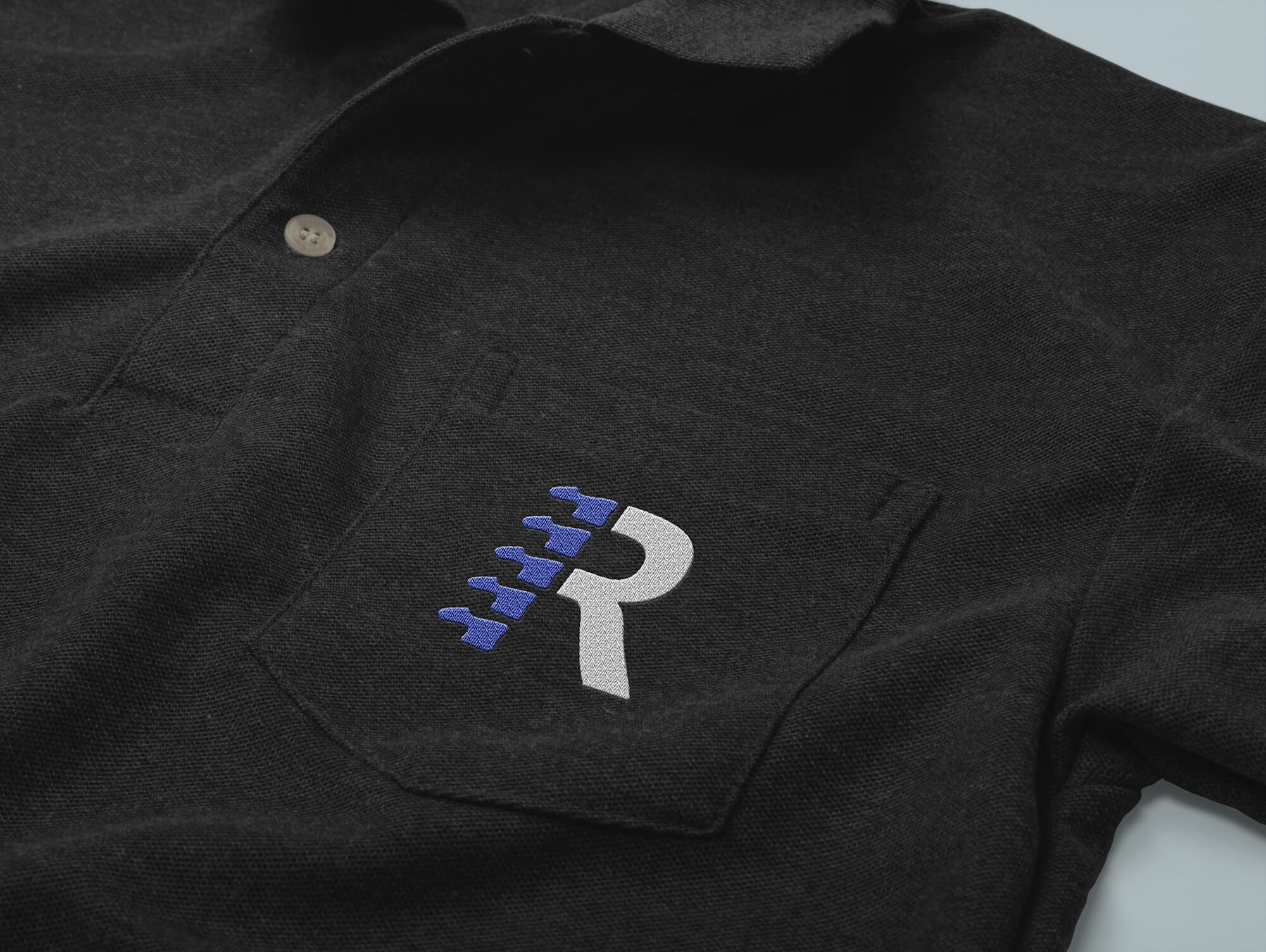
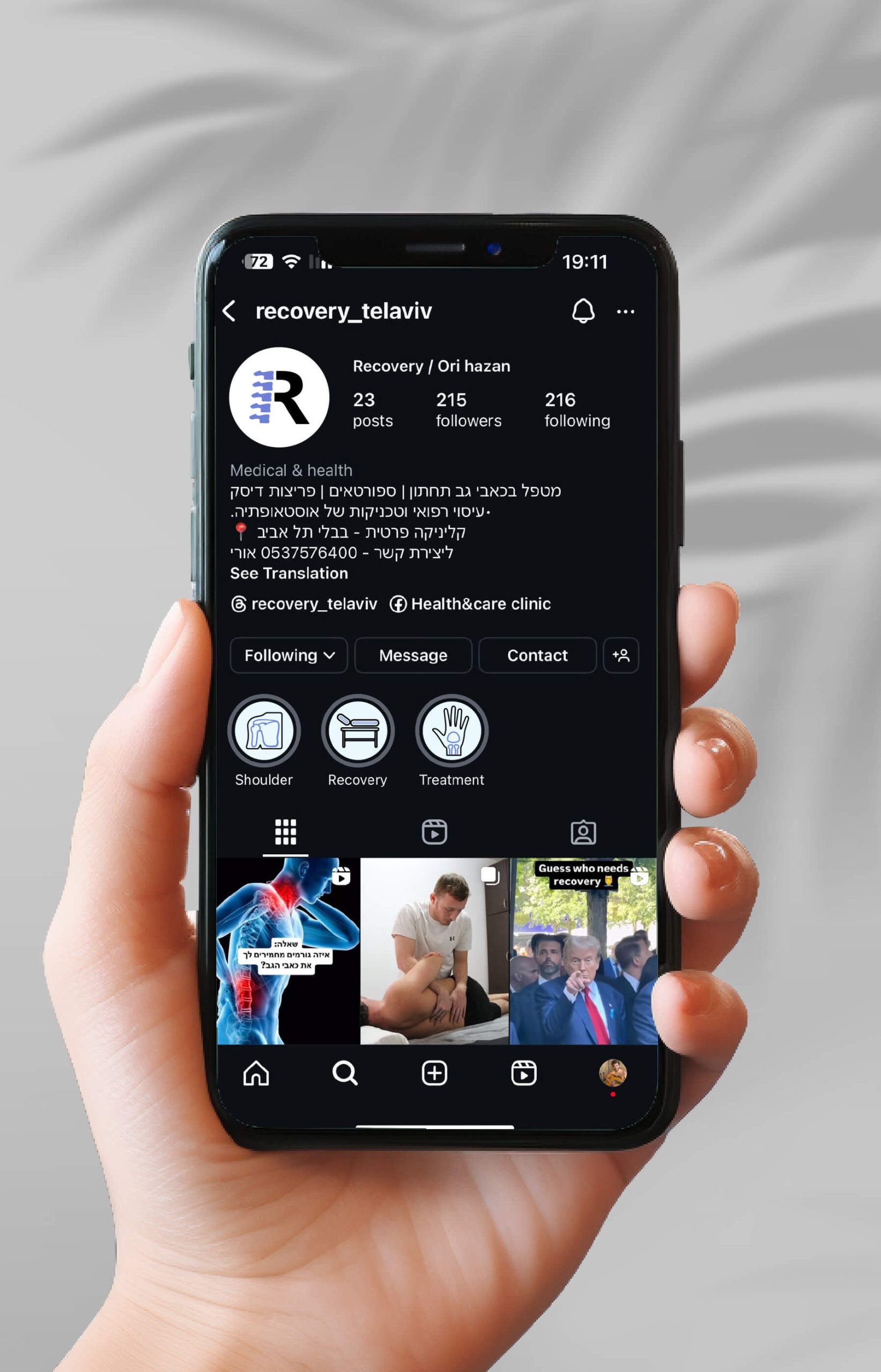
Primary Logo
Logomark
Text Logo


R: 14, G: 0, B: 48
C: 100, M: 98, Y: 42, K: 67
R: 233, G: 251, B: 255
C: 10, M: 0, Y: 2, K: 0
R: 110, G: 128, B: 214
C: 64, M: 50, Y: 0, K: 0